|
|
|
This page last updated on 01/26/2019. Copyright © 2001-2019 by Russ Meyer |
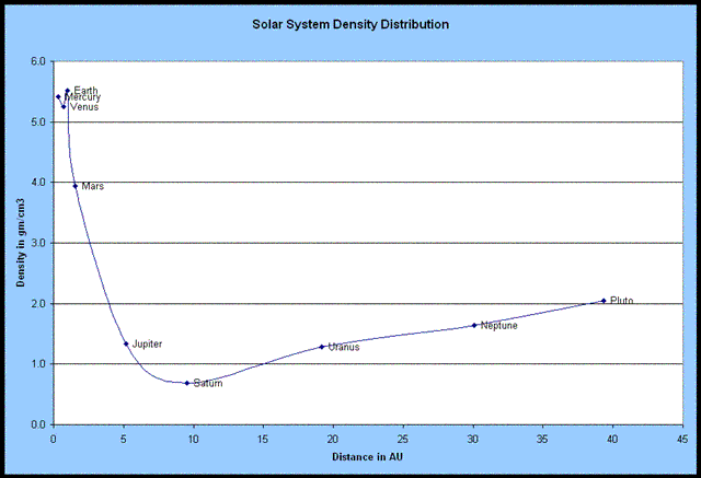
Plotting the Data I plotted planetary density in grams per cubic centimeter against distance from the sun in astronomical units using data from here. Here's what I got:
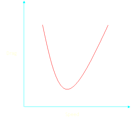
In a very gross way, it did confirm my thoughts that planetary density decreased with distance from the sun. However, I did not expect the density to increase for the planets further out than Saturn. After looking at the graph for a while, I thought it looked a lot like a drag graph for an airplane. Just for reference, here's what one looks like:
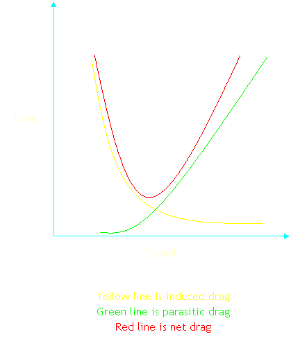
The "U" shaped curve is commonly referred to as the "drag bucket." It is actually the summation of two different sources of drag on an airplane. One source is just the plain ol' speed of the airplane through the air and the drag that creates. This is known as "parasitic drag" and increases non-linearly as the speed of the airplane increases. The other source of drag is "induced drag." This is the drag caused by the airplane wing as it generates lift. This drag decreases non-linearly as the speed of the airplane increases. Here are those two components revealed:
Anyway, the density distribution graph struck me as sort of looking like the drag bucket of an airplane. It leads me to think there are two different factors at work contributing to the net density of planets as their distance from the sun increases. Trying to Explain It All There does seem to be a fairly clear pattern of density distribution with increase of orbital distance. I think there are two different factors at work. Factor 1 - The Left Side of the Graph The curve of the line out through Saturn is really prominent. I think there are a couple of possible explanations for it:
Factor 2 - The Right Side of the Graph Ah yes, this is the part of the graph that surprised me. I really don't know how to account for the rise in density from Saturn outward. Perhaps it has to do with temperature. As you get further out things are getting a lot colder. Elements that were formerly in a gaseous phase are now solids, increasing density. Things like ammonia, methane, nitrogen, etc. It should be possible to test this theory to see if passes muster. The elemental composition of planets is know fairly well. It wouldn't be too hard to check the phase transition temperatures of those elements against the mean temperature of each planet to see whether it is a gas, liquid, or solid. The effect that has on density could then be accounted for. You could plot a sort of "normalized density" against orbital distance to eliminate the effect. Closing Thoughts Perhaps it would be better to graph something other than density against orbital distance. Something like oh...shoot, I can't think of anything right now. It would be interesting to look at mass distribution against orbital distance. If the Momentum Distribution theory is correct, then the distribution of mass in the solar system should tell you something about the general composition of the interstellar medium from which the primordial cloud coalesced. That in turn could give you some clues as to stellar evolution and what generation of star the sun is. |